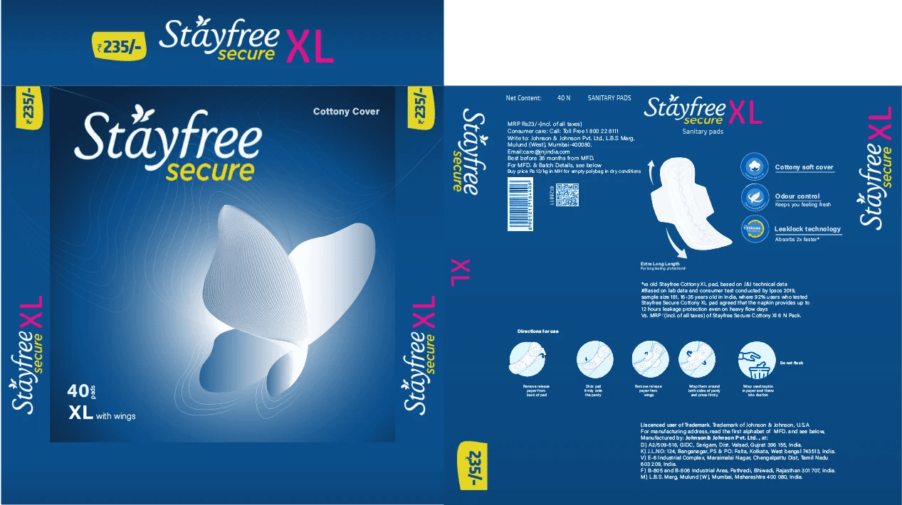
Stayfree
Field
Scope
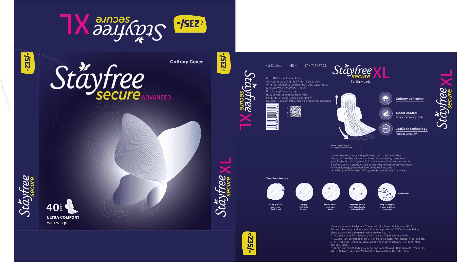
RePackaging
Branding
Credits
Vipin Chandran Pathiyil
Year
2021

Project Overview
This project focused on re packaging an existing FMCG product to improve its shelf value while retaining brand familiarity.
I chose Stayfree sanitary napkins to explore how small visual changes could create a more comfortable and emotionally aligned buying experience.
Stayfree is a brand of hygiene product for female during their menstrual cycle. Johnson & Johnson boost this product for women to live an active life without any concern.
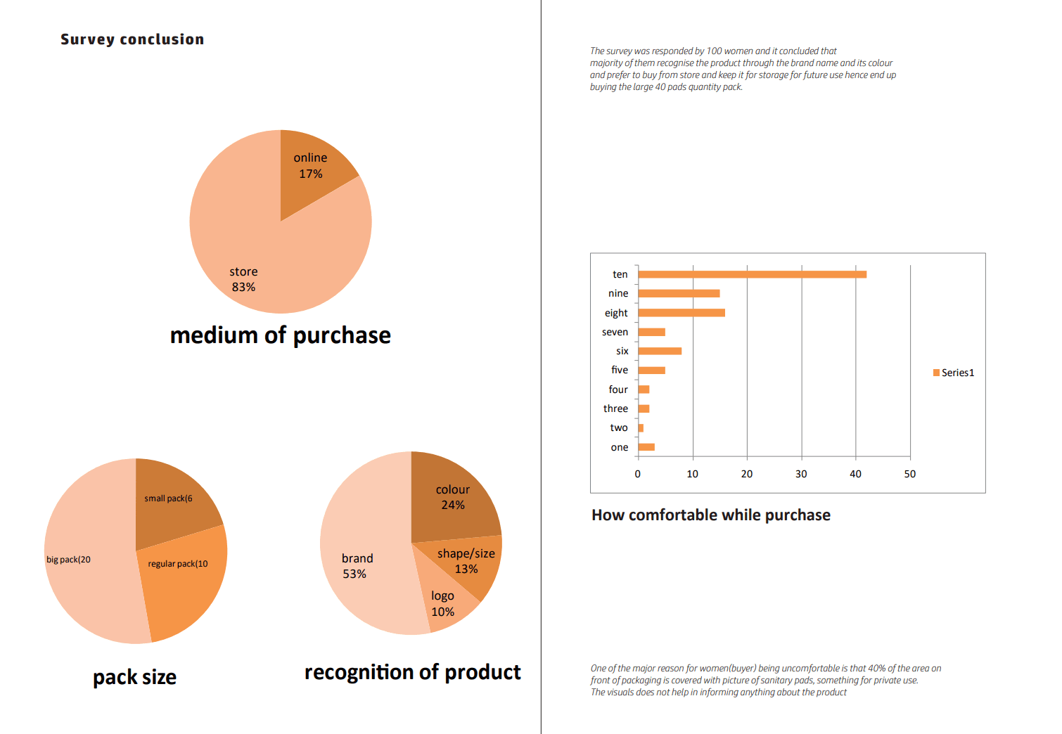
Problem and Survey
Sanitary pad packaging from leading brands often appears loud, crowded, and visually overwhelming.
For a personal product, this creates discomfort rather than reassurance. A survey conducted with over 100 women revealed a shared preference for calmer, more discreet packaging.
Many felt that existing designs did not reflect the brand values they claimed to stand for, such as care, softness, and confidence.
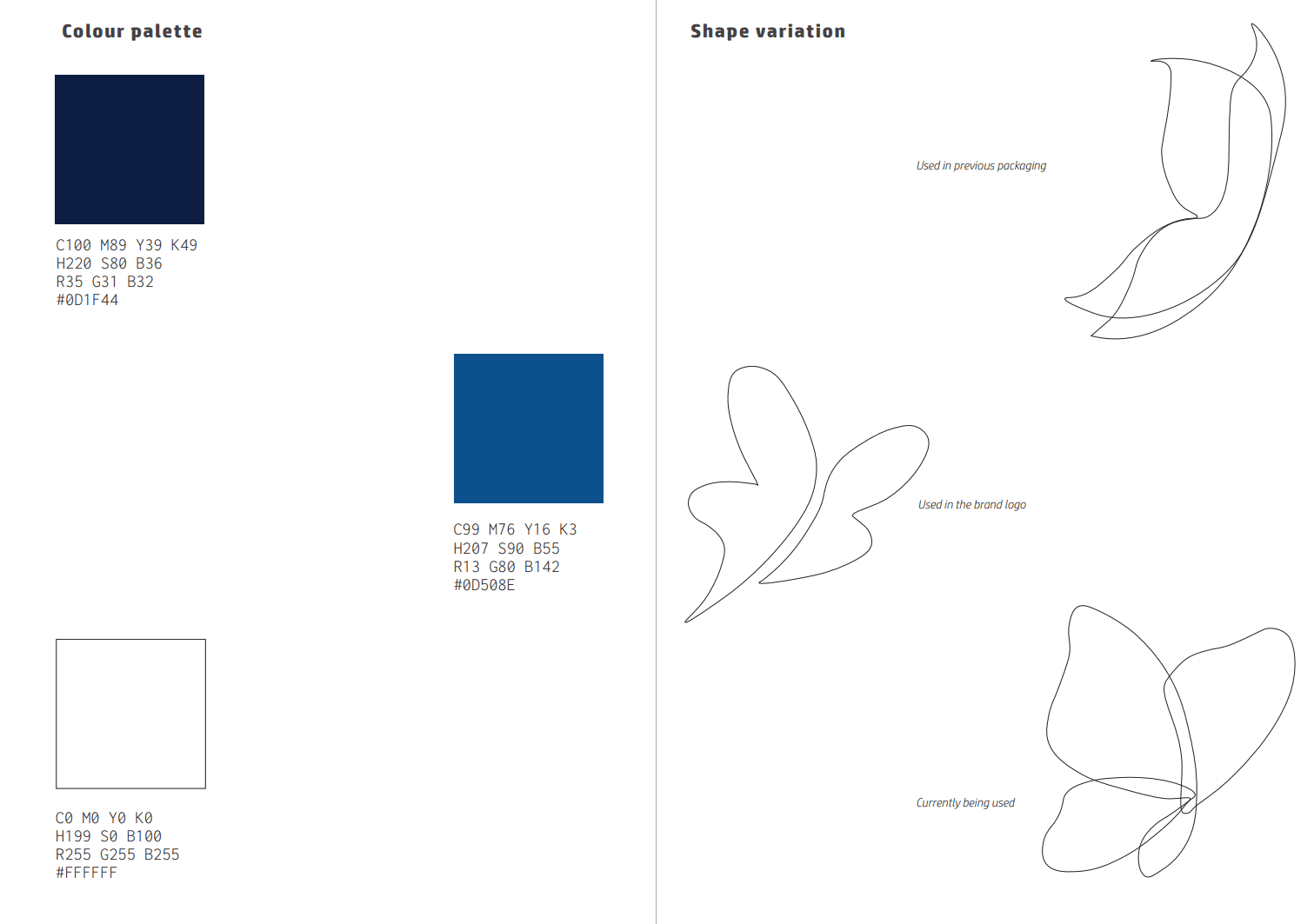
Solution
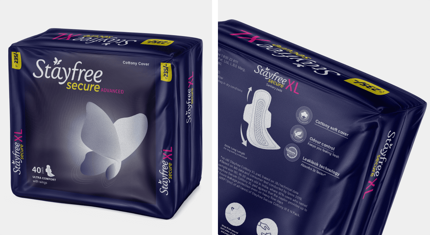
The redesign kept the original structure of the pack intact while shifting the visual focus.
The butterfly, a key brand element, was strengthened to reflect lightness and comfort. Graphic visuals of the pad were reduced, and information was simplified to essentials like pad count and size.
The overall feel was softened to make the product easier to pick from the shelf and carry.
Conclusion
By changing the focus and tone rather than the format, the packaging feels refreshed without losing familiarity.
The final design aligns better with Stayfree’s brand values and responds directly to user discomfort, creating a shelf presence that feels calm, respectful, and reassuring.
